Capital One
Lifestyle Recommendation Platform
- Financial
- B2C
- Agile Development
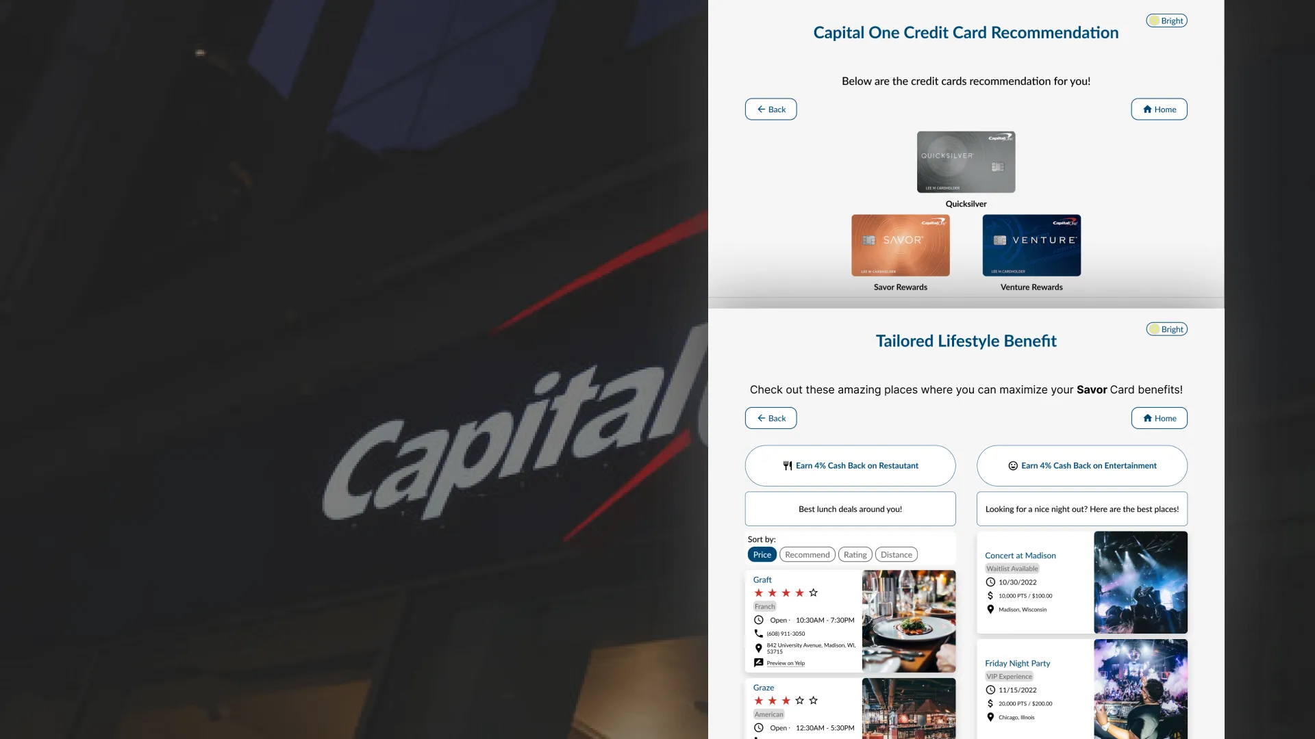
I played a key role in building Capital One's Lifestyle Recommendation Engine from the ground up as a member of an Agile team. Our work helped users choose credit cards based on their habits and maximize their rewards points.
- My role
- Product Designer, proxy Project Manager
- Team
- 1 Product Designer, 1 Project Manager, 8 Engineers
- Duration
- 3 months (September - December 2022)
Background
Capital One's project mentors have tasked us with building a Lifestyle Recommendation Engine from scratch. This engine will provide users with a quiz about their lifestyle and spending habits to help them find the best way to apply their points. Users will receive a recommendation for a specific Capital One credit card based on the quiz results.The engine will offer tailored recommendations for restaurants, rental cars, flights, and hotels based on the card selected by the user to help them maximize rewards.
Problem
No existing engine provides users with tailored recommendations to maximize rewards.
User & Goal
Users could be anyone interested in applying for a credit card. The first feature aims to recommend the best credit card to users based on their lifestyle, while the second feature helps users learn how to maximize rewards on their credit card.
Challenge
How can we build an intuitive and tailored recommendations engine for users from scratch in four months?
Solution: Final Design
Ultimately, we delivered the product on time, including both key functions: credit card recommendations and tailored lifestyle benefits. We adjusted based on user feedback and reduced the number of questions. However, there were some differences between the Figma prototype and the final website due to the time constraint.
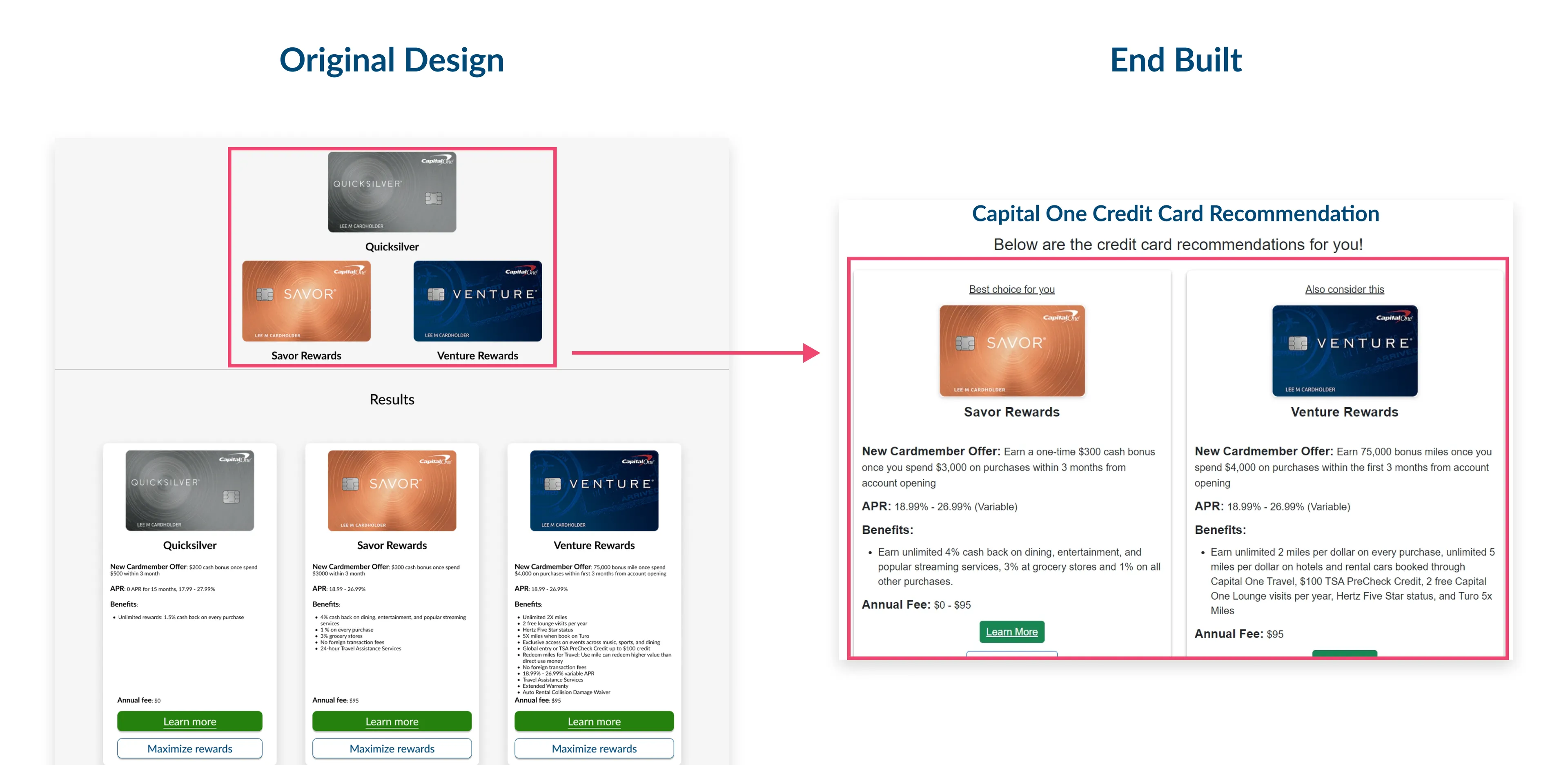
1. Credit Card recommendation page
Instead of showing pyramid-style recommendations, I proposed a more straightforward approach due to time constraints and prioritization of Feature 2.
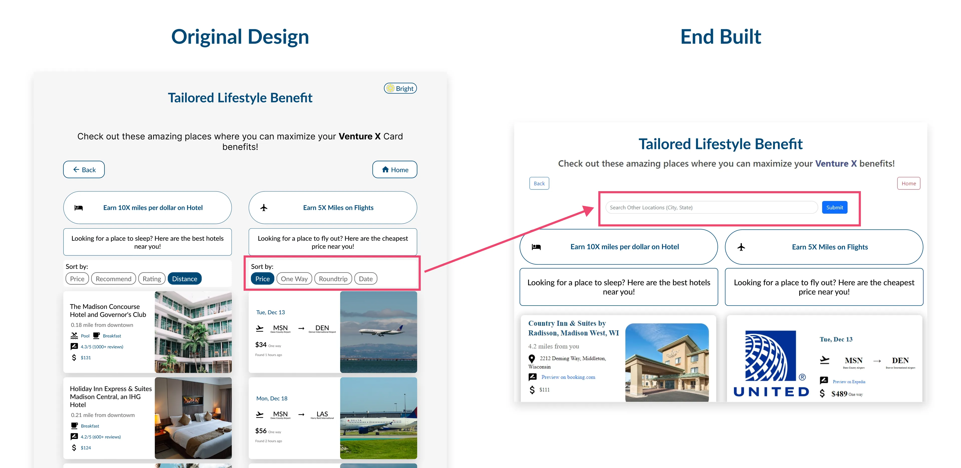
2. Search function instead of "sort by"
I proposed using the search function to meet the project's time constraints. However, if we had more time, we would have explored the "sort by" option further to ensure that users could easily find the reward option they were looking for, improving the overall user experience.
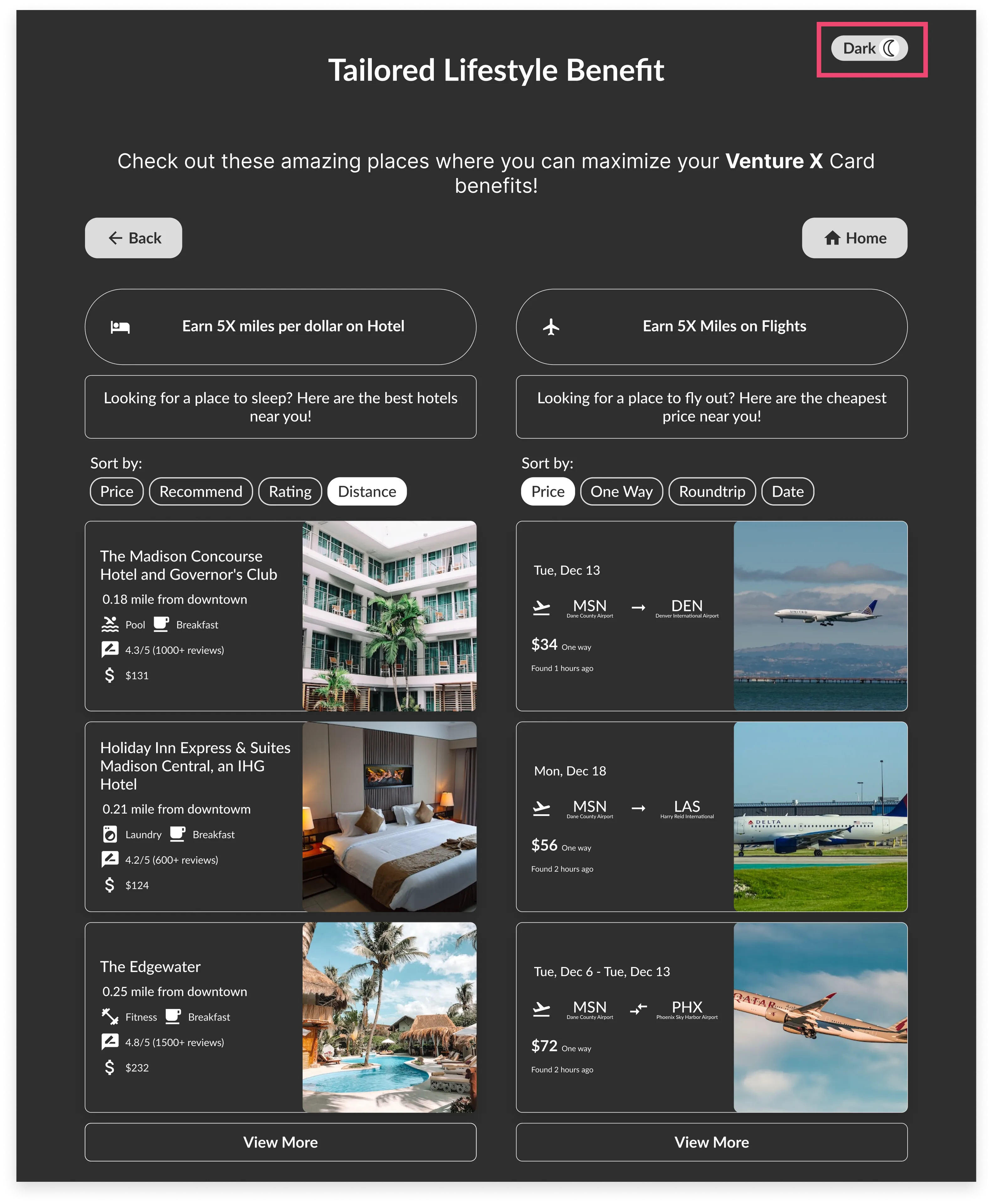
3. Bright and Dark mode
Limited by time constraints, the dark mode feature couldn't be fully implemented. However, user testing preferred dark mode, particularly at night, as it reduces eye strain. We acknowledge its significance and will continue to explore ways to optimize this feature in the future.
Demo
Impact
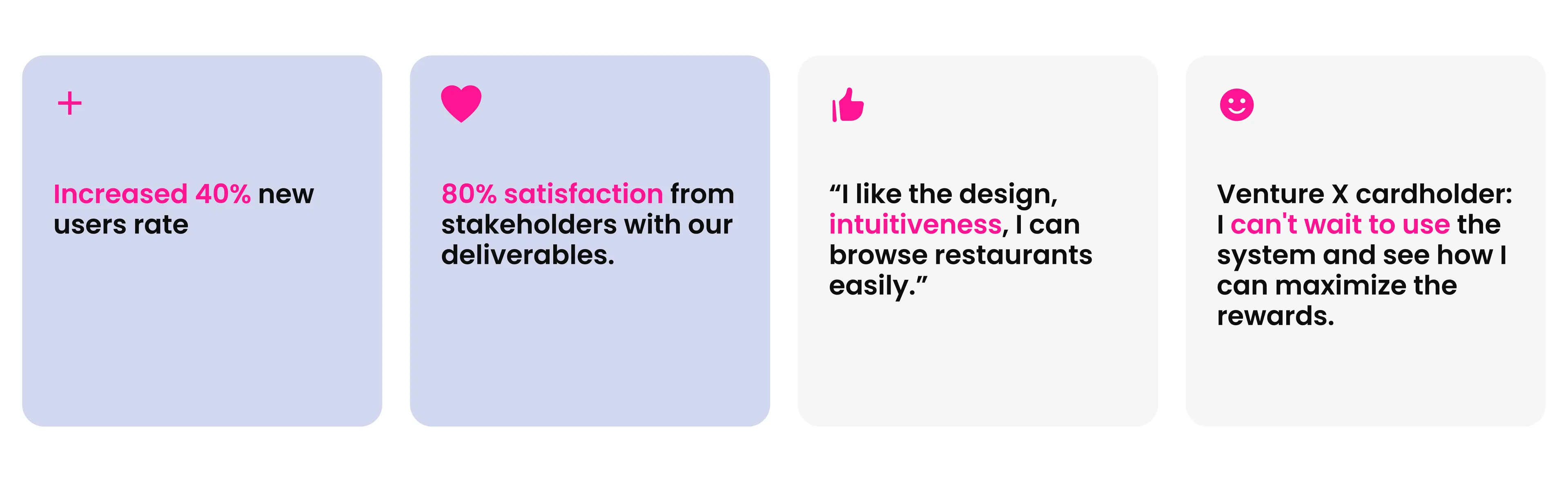
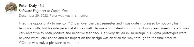
What Stakeholder Say About Me
Design Process
Prioritization
Given the time constraint, I played a critical role in the prioritization process by collaborating with the project manager and engineering team on day 1 to define project goals and requirements based on user needs and business objectives.Through this process, I influenced the team to prioritize features that would impact the user experience that met the needs of our target users
Planning
Narrow scope into 2 functions and implement Agile Scrum in the C1-X team
We streamlined communication and alignment by focusing on two key functions: credit card recommendations and tailored lifestyle benefits. I suggested researching and creating wireframes on Miro to ensure a user-centered approach. I also suggested rapidly testing and gathering feedback so we could create a final interface that was technically feasible and goal-oriented.
Research
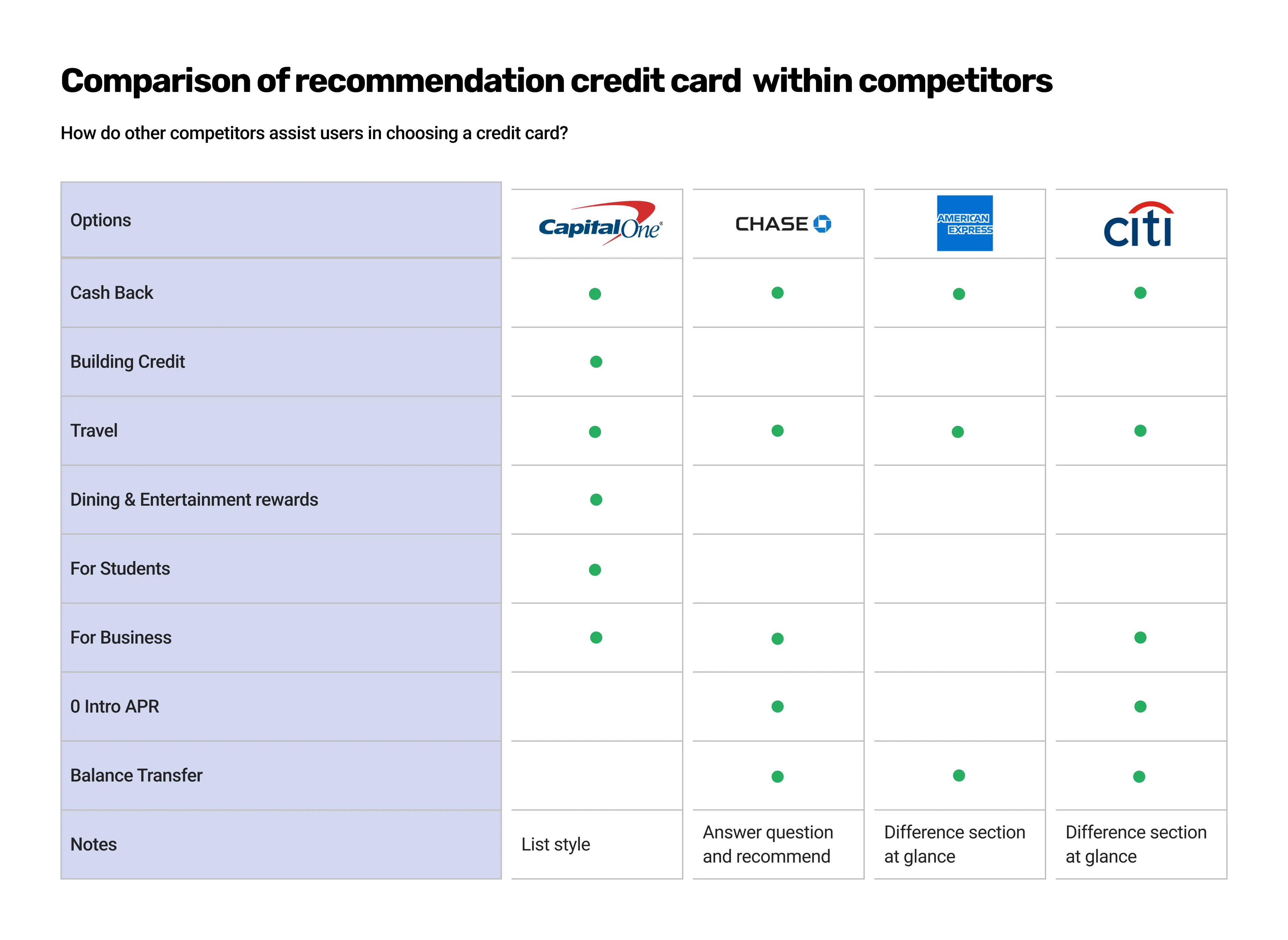
Competitive analysis for the feature 1 credit card recommendation
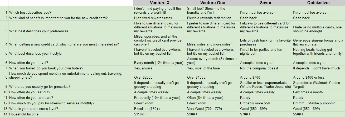
To understand which questions to include, I researched how other companies assist customers in selecting the best credit card. This led me to formulate questions that could extract information about a customer's lifestyle and habits. Interestingly, most questions revolved around the same benefits, such as travel, hotels, cash-back rewards, and no annual fees.
We created a list of questions based on the four Capital One credit cards we chose.
Ideation
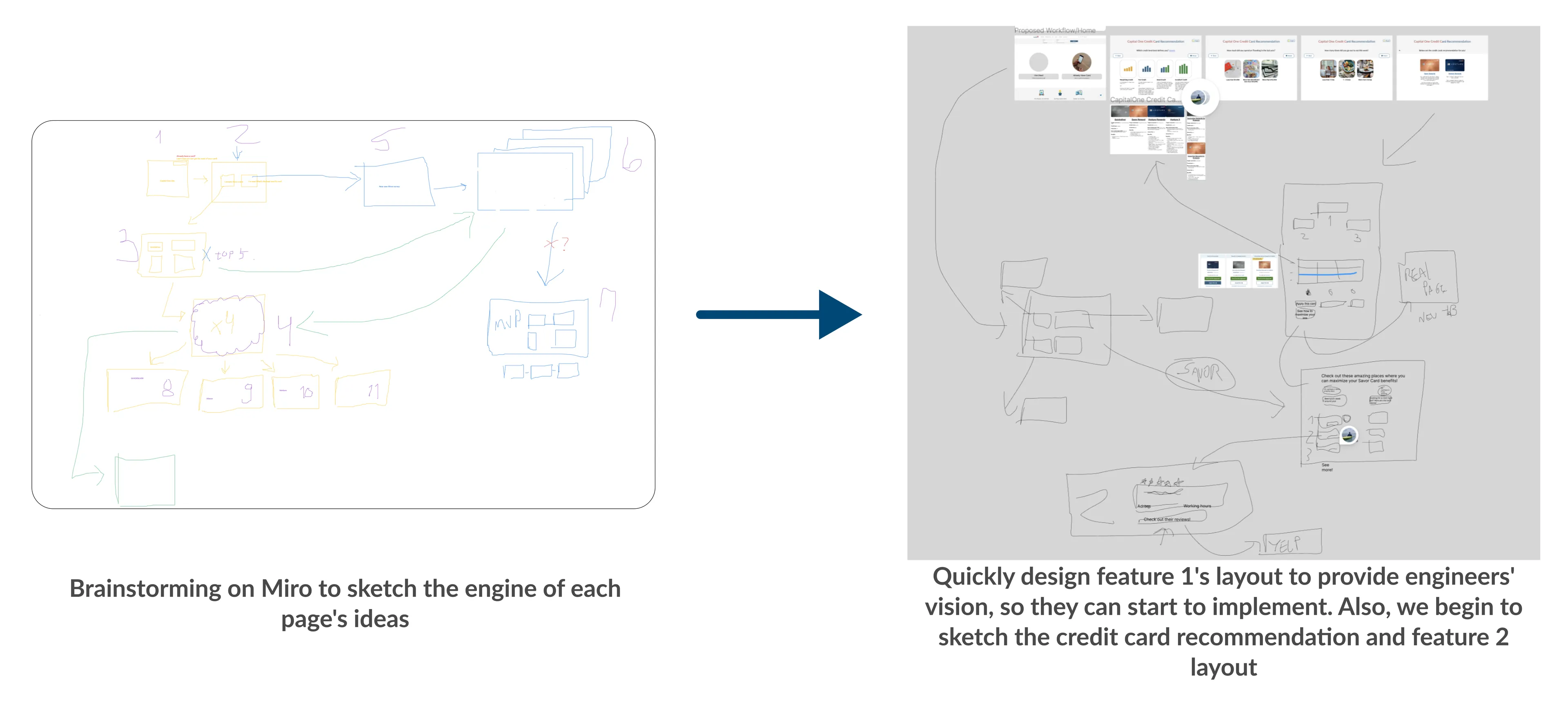
Brainstorming with the team
We began by brainstorming and outlining the overview. I recommended using Miro to visually represent the project scope to ensure clear communication and alignment among the team.
However, I was concerned that there may still be some potential for miscommunication, so I quickly created wireframes in collaboration with the engineering team to convey the project vision and get their input. This approach allowed us to move toward a high-fidelity, user-centered, and technically feasible design.
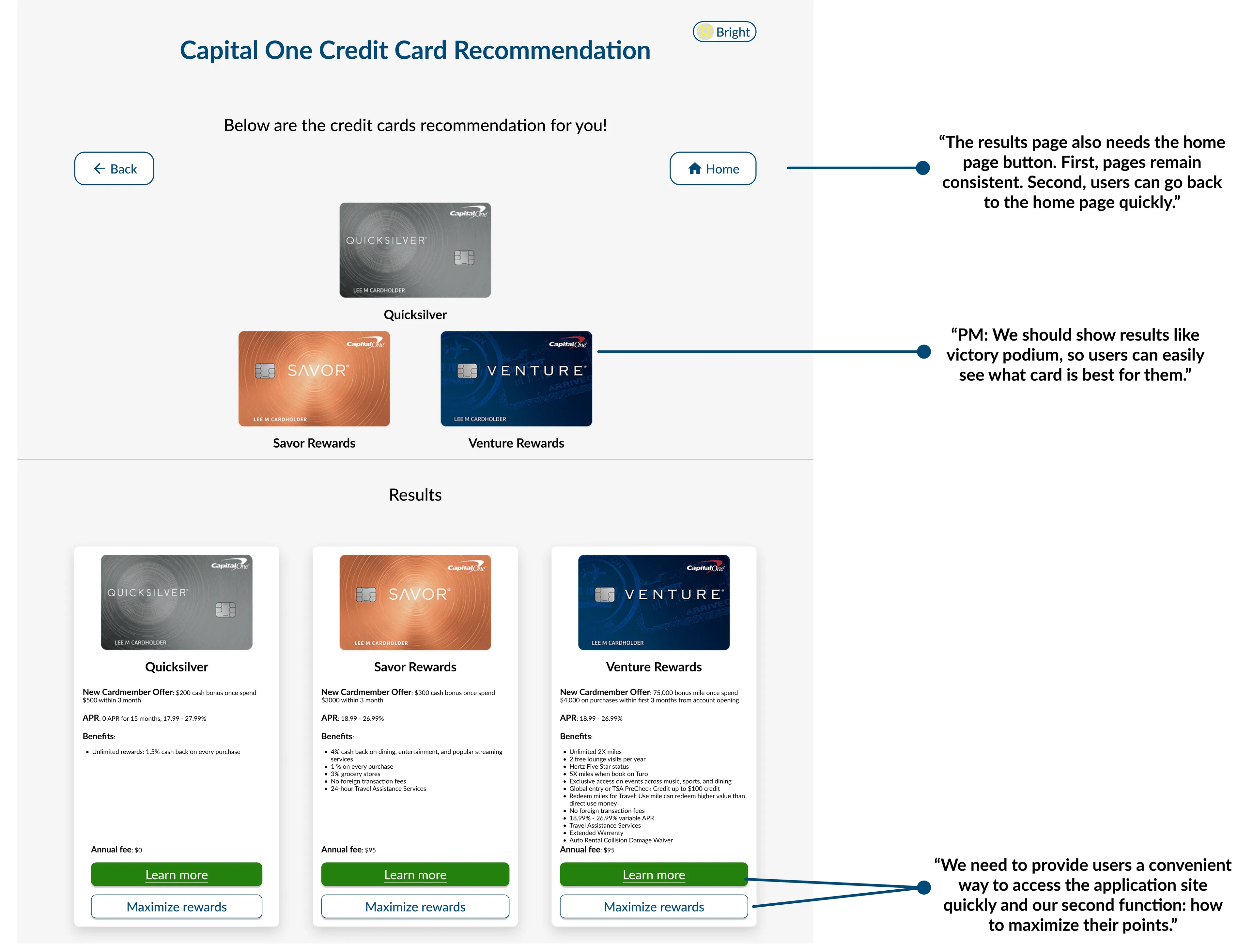
Next, I designed the credit card recommendation layout based on the daily discussion and feedback from the team. The daily stand-up allows me to gather the team's opinion quickly and iterate my design for our final demonstration.
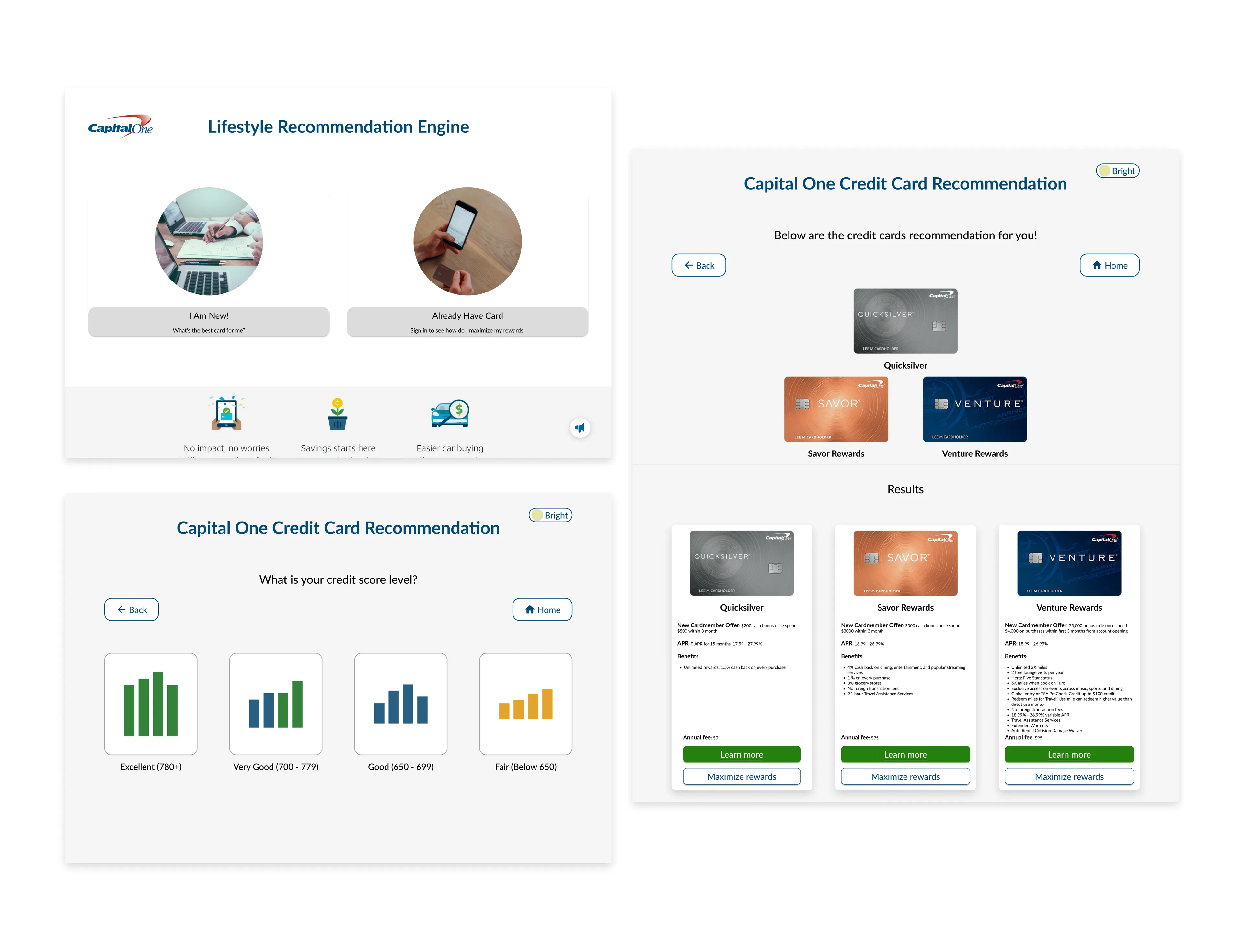
I then quickly created a high-fidelity prototype of feature 1 for the engineers to implement.
Design Evolution
While the engineering team was developing Feature 1, I kicked off Feature 2 based on the ideas generated from our discussions. I regularly sent prototypes and gathered feedback on my designs during this time.
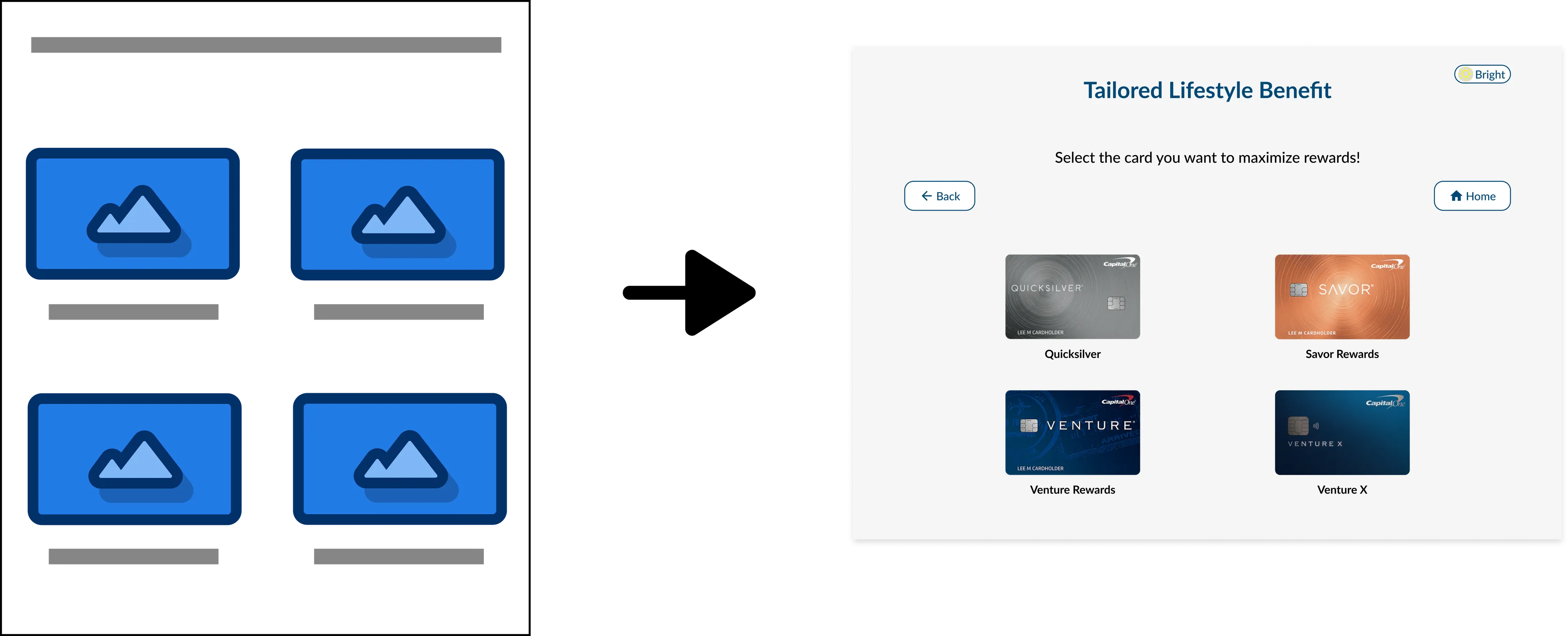
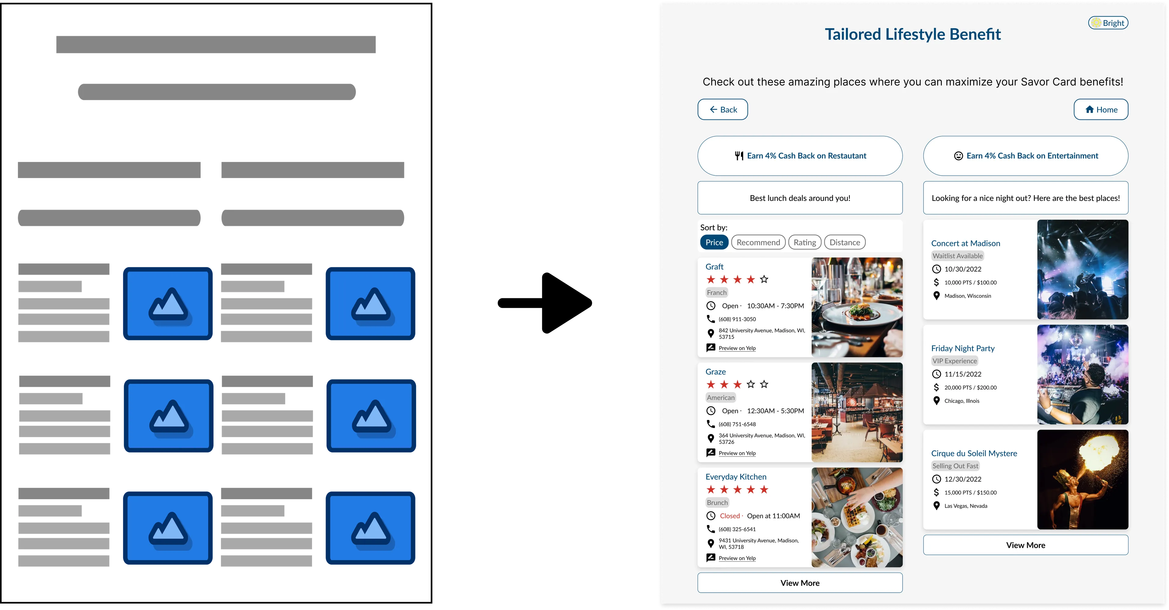
It was initially challenging to design feature 2: tailored lifestyle benefit because I started from nowhere.
I researched similar websites for inspiration to create a familiar and intuitive design. After browsing and gathering ideas, I mimicked the design and conducted testing to ensure its effectiveness. Fortunately, the team and mentors were impressed with the final design and deemed it intuitive.
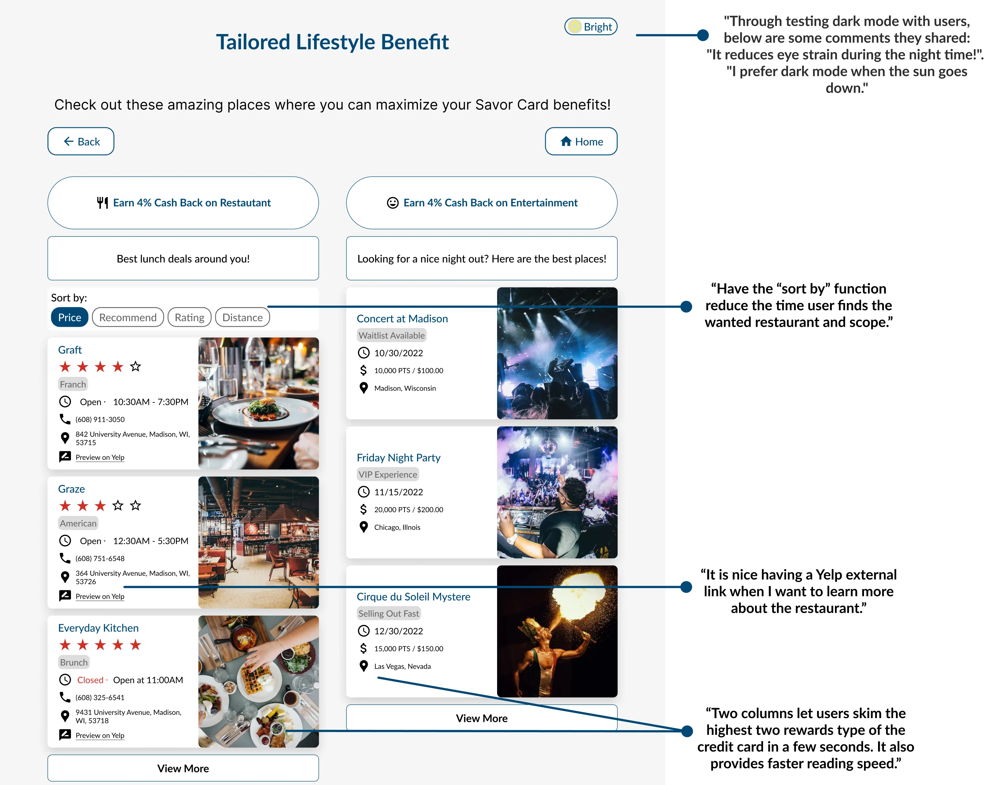
Key learning
Collaborating with Engineers and PM
I struggled to build the vision and get opinions from engineers during the ideation phase. Only some of the team members shared. I immediately discussed it with the PM. Rather than broadly ask them ideas, I narrowed it down to specific questions: Where should buttons or card options be placed on the page? We successfully have more feedback, leading to a satisfactory product!
Fast Paced Environment
Scrum helped our team grow and progress through daily stand-ups, weekly sprints, and retrospectives. The daily stand-up and retrospective benefited our team because they helped us update progress and solve problems together immediately. For example, when front-end engineers had difficulty extracting pictures from Figma, I immediately taught them how to do it. This technique tightened accountability and ensured the product deliver on time without flaws.
Design Impact
In my collaborative work experience, I've learned the power of effective design communication. I showcased how my designs improve user satisfaction and drive successful project outcomes through compelling presentations. I got team buy-in and sought feedback. Clear communication and collaboration are vital in achieving unique project goals, and I'm committed to applying these skills as a designer.
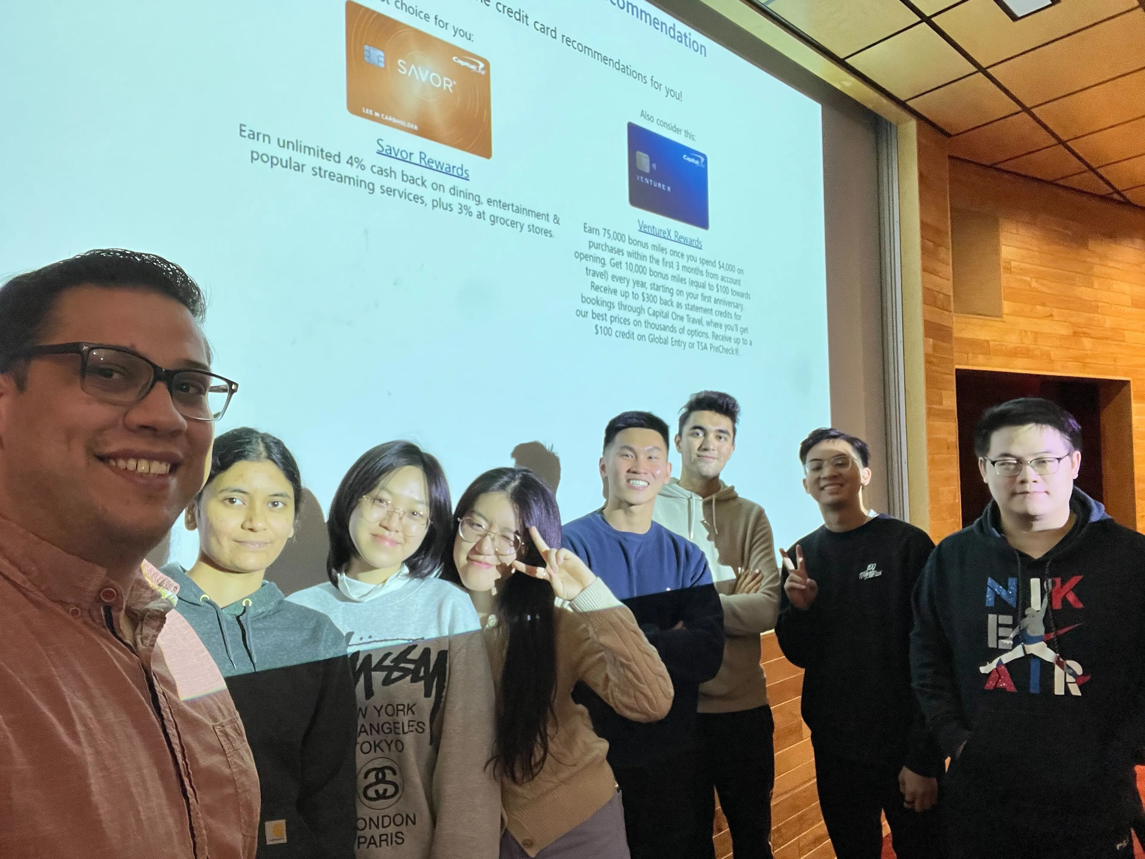
If Have More Time...
We would make our communication better. If everyone’s time allows, we would like to try traditional daily stand-up meetings since in-person meetings can update at once. Asking for help from other team members and mentors did not happen too often because I was in an environment that let everyone be open-minded and needed more time to adapt. Finally, we would invest more time in retrospect at the end of each sprint because we missed some weeks, which can improve our products and integrate our team better.